
TheLighthouse
A career development platform that matches young professionals with people who can give them personalized insight to help their career growth.

The Product
TheLighthouse is a mobile responsive career development platform that matches young professionals with others who have experience in their area of interest / the area they need advice in. They are matched by TheLighthouse after they take a quiz (“The Career Quiz”) which asks questions about what they need help with and what kind of person they’d like to speak with. After the match, users book video sessions with their matches and are also connected via Slack.
Project Completion Date: November 2019 - February 2020
My Role
I have acted as the sole UX designer with a small team of 4 (CEO, developer/PM, UI designer, and myself). I designed the onboarding experience and solved for the personalization of the Career Quiz / Matching process for users. I designed user journeys, user flows, and low to mid fidelity screens. I also ran product research and in-person A/B testing.
Career Quiz Redesign
Overview
Problem Statement
TheLighthouse’s Career Quiz is currently a one-sized-fits-all process which hinders TheLighthouse from getting its users their best-matched career mentors. How might we make the Career Quiz personalized to TheLighthouse’s multiple user types?
Hypothesis
Gaining a better understanding of our user types and creating a Career Quiz that has multiple flows will more closely address the needs of TheLighthouse’s different users, and allow them to be more closely matched with mentors.
The Discovery Phase
User Personas
After meeting with TheLighthouse team and discussing the research they had done and users they have experiences, I constructed one user person, Corey, to get a feeling of what type of individual was using the platform.

User Persona showing Corey S., an average user of TheLighthouse.
Most users were similar to Corey in Needs, Behaviors, Age, and Frustrations.
But what truly set apart each of TheLighthouse’s users were their GOALS.
The Career Quiz worked for users who wanted to do such things as:
Negotiate a salary raise
Apply to a new program
Make a career transition
The Career Quiz did NOT work for people who:
Felt completely lost in their career
Had a very specific (unlisted) goal they wanted to work towards
The Design Phase
Features
The Career Quiz Must:
Tell TheLighthouse what the user’s goals are
Allow users to specify what kind of person they want to be matched with
Possibly: Asks questions about demographics/ personality
Be able to be taken multiple times as goals change
Not be overwhelming
Be appealing / fun
Be personalized / Relevant to user
User Flows

Current Career Quiz Flow vs Redesign
User Flow Examples
I used user flows to map out how different users may be led to different questions based on their responses during the Career Quiz. As you can see, the left side has one flow for each user. The right has multiple pathways depending on user goals.
Mid Fidelity Career Quiz Wireframes
Iteration 1 - Option A. Quiz Format
Example of changes featured in the Option A redesign. Shows how the user is brought to different questions based on their first response.
The first and most important change I made was taking users to different paths based on their goals. Users who are completely lost will not have to answer questions about industry and role later on, instead they go on to answer questions about their interests.
Users who have a specific goal will also not have to answer many extra questions about who they want their mentor to be, instead they have more free form questions so they can get straight to the point.
Iteration 1 - Option B. Booking Form
Example of Option B redesign. This shows a form format which allows the user to answer all questions on one page.
The Booking Form option allows users to more easily and quickly refill it as their goals change to get their new matches. Although, it is less personalized and does not offer multiple pathways.
The Testing Phase
A/B Testing
Option A versus Option B

Image showing the scenario, task, and questions given during A/B testing.
Tested with 6 young professionals aged 22 - 35
Had users test with both Booking form and Quiz form (order was switched)
Recorded notes about users’ experience and remarks
Positive Insights
All users preferred Career Quiz flow.
More visually engaging
More personalized / inclusive
Helps users to organize their thoughts/wants
Booking Form is too content heavy
Users found the last question “is there anything else we should know” is very important.
Allows users to make comments about the demographic or any other detail about what kind of person they would like to be matched with.
Sample text in the boxes is very important to guide users and let them know what kind of information they should write in form fields.
Negative Insights
Users want to select multiple goals and do not initially understand that the Career Quiz applies to the goal they want to presently work on with their Match
Users do not initially understand they they may fill out the Career Quiz more than once, and set new goals in the future.
Users are confused when the questions change from asking about themselves to asking about who they want their mentor to be.
Users are frustrated when they do not realize they can skip questions.
Users are confused about the difference between industries, roles and areas.
Mid Fidelity Career Quiz Wireframes
Final Iteration
Page letting user know what to expect during Part I of Career Quiz.
Page letting user know what to expect during Part II of Career Quiz.
I added sections to separate Part I (questions about user) from Part II (questions about who the user wants to be matched with).
The Titles of each part “Your Current Objective” and “Your Request for Matches” also remain at the top of every page of the corresponding section.
This clear change will quell user’s confusion about the shift in question focus.
I created a different format for “role” questions to show roles under each category. The button for the entire category can be pressed as well, automatically highlighting all roles in that category.
Showing actual role titles will eliminate user confusion about industry vs role.

Before & after redesign of question/response format for question asking the user what role they’d like their match to work in.
To view all changes, continue to link and check out the final redesign
Onboarding
To get a better picture of the process the user goes to when using TheLighthouse for the first time, I created a User Journey. In this way, I identified areas where an onboarding experience would be beneficial.
User journey map illustrating the user’s initial experience using TheLighthouse and during which steps onboarding may be beneficial.
Low Fidelity Wireframes
Starting with low fidelity sketching allows me to experiment with many ideas and get early feedback from my team without wasting resources on time consuming designs. Here, I played with the ideas of a landing page styled onboarding and an instructional style onboarding.


Mid Fidelity Wireframes
The client wanted a tutorial type onboarding with screens to demonstrate the value of TheLighthouse and let the user know what’s coming next.
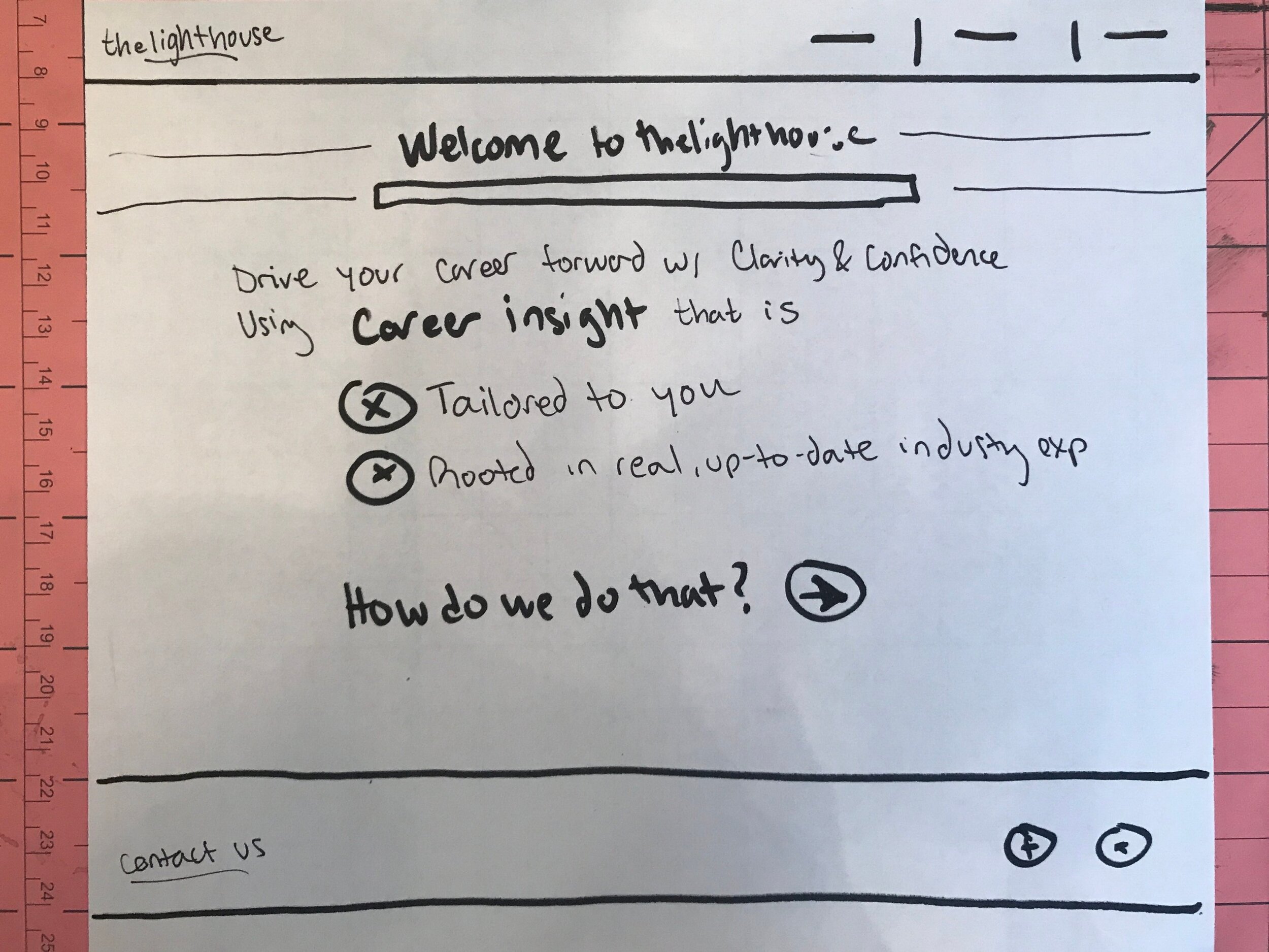
I began with two screens to demonstrate value. These screens let the user know how TheLighthouse will help them, and what differentiates TheLighthouse from other career development platforms.
Two mid fidelity designs to demonstrate value of TheLighthouse during onboarding.
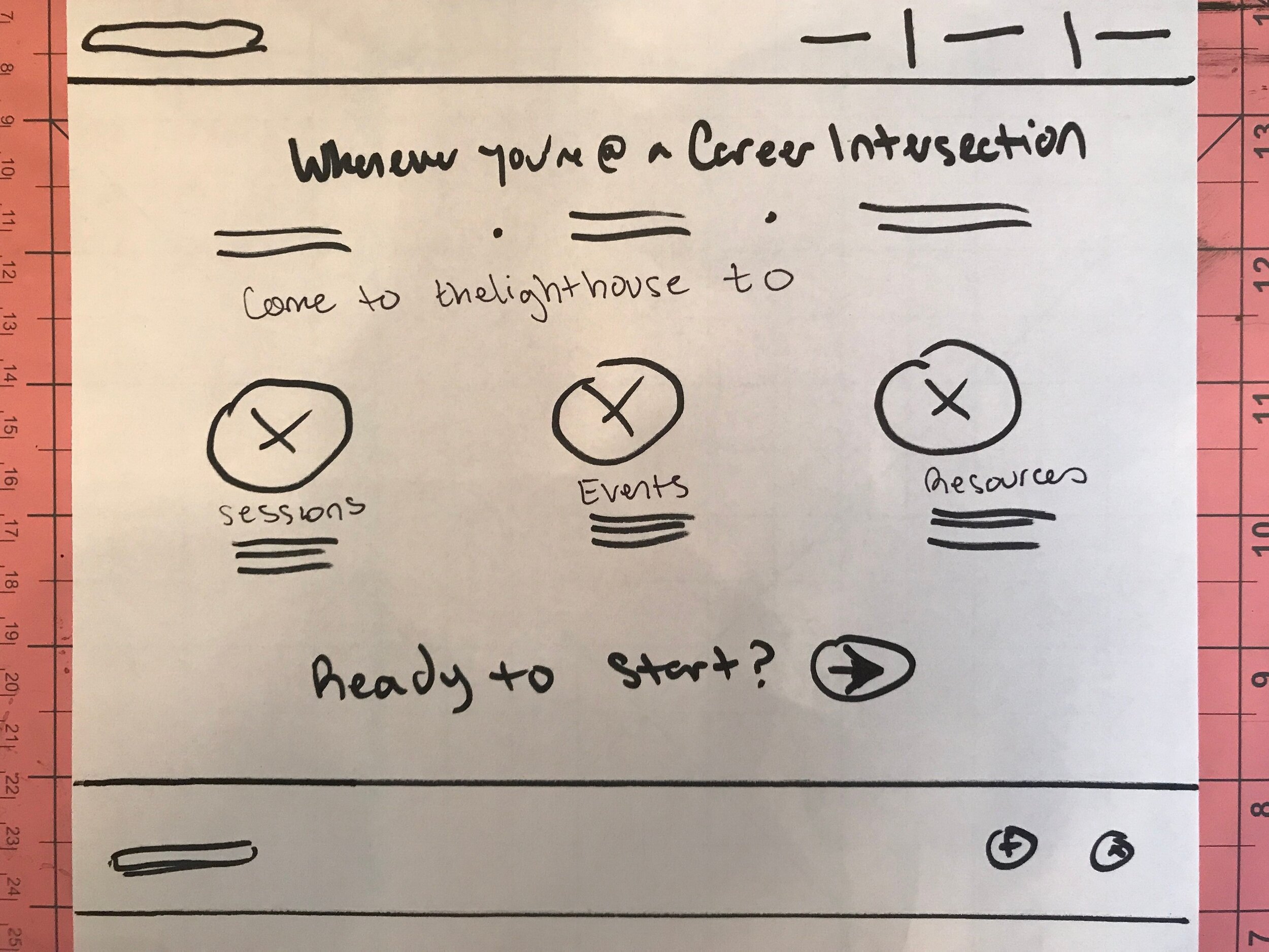
Then I worked to design the screen which would prepare the user for next steps.

Four mid fidelity options for tutorial-type onboarding.
I designed a few different layout variations for the client.
The client wanted a tutorial type onboarding with screens to let the user know what’s coming.
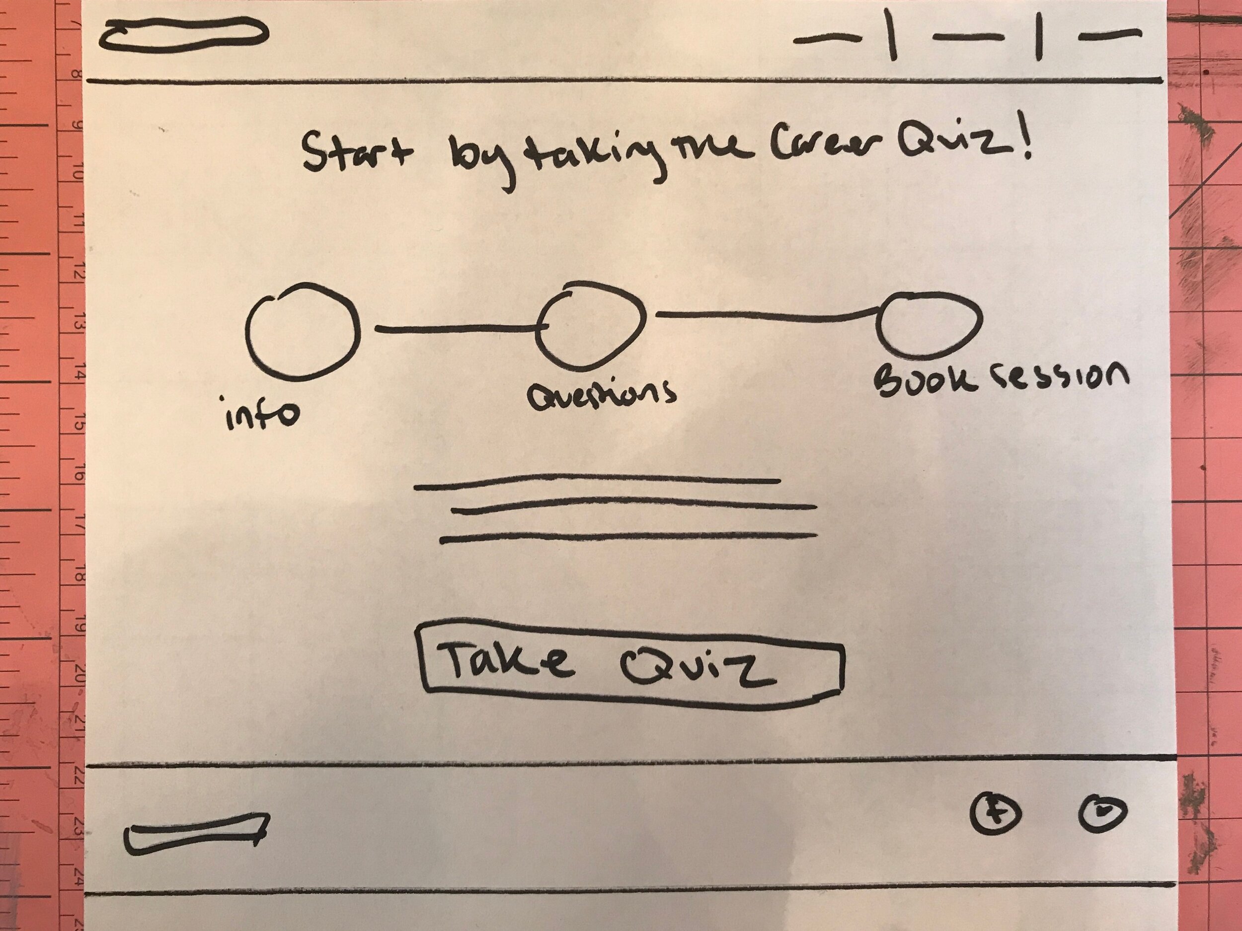
Because TheLighthouse users were already told about the process during initial signup and again during their initial one-on-one session with the CEO, I advocated for a one screen approach that gives the user a quick overview of the process.
This allows the user to interact with each step and learn more if they choose to click into that particular step.
This will minimize user frustration, as it has been proven that most users skip through onboarding screens, finding them hassle-some and excessive.
High Fidelity Onboarding Wireframes
Final high fidelity onboarding screen designs.
I minimized the number of steps for clarity, colorized using colors from TheLighthouse style guide, I found icons and images to assist in user comprehension and increase happiness, and I wrote copy to verbalize the most important points.
Press the button above to click through the onboarding timeline and view all copy.
Next Steps
Conduct usability testing with new users during onboarding process to receive feedback
Observe and get feedback from users who take the Career Quiz multiple times to receive multiple matches
Create a profile page for users where they can include more personal information regarding their career interests
Transition TheLighthouse into a tool that users continue to use throughout their lifetime, which helps them plan their career and visualize their progress and goals.