
Kikori App
An app which allows teachers and facilitators to choose and create experiential education activities for students.

The Product
Kikori is an early stage education startup designing an app which allows teachers and facilitators to choose and create experiential education activities for students. It is the first of its kind and will replace textbooks with a database of activities, saving teachers and facilitators time and stress and money. The current version allows users to search, filter, and create activities and “playlists”. The future version I am working on will allow all of this plus searching by location, personal calendars, connecting with organizations, and a creation of social media by way of public profiles, Activity Timelines, and messaging.
Completion Date: In Progress
My Role
I have synthesized research to draw insights about customer needs and create user stories and personas, and I am working with a partner on the future Kikori version to integrate new features, create new style guides, and design a corresponding web app. I am also designing and running usability tests and working with the developers to add screens and make functional improvements to wireframes for the current version.
Team: Working with one other designer and a team of developers, CEO, PM, content creator, marketing manager, in an agile environment to make changes to current product and create a new future product.
Support us on Kickstarter and help bring the Kikori dream to life!
Problem Statement
Kikori users include teachers, parents, and facilitators who are often working under tight money and time constraints. The current app is very basic, only allowing users to search and create activities. How might we integrate features to increase Kikori’s value to its users and incorporate it into daily lessons?
Hypothesis
Listening to the needs of our users will help us to figure out which features will be the most helpful. Streamlining the design of the current app, making interactions more obvious, and using the current structure as much as possible will make the Kikori 3.0 redesign the most intuitive and useable to both current and new users.
The Discovery Phase
Synthesizing Research
Many interviews had been conducted with our three user types: teachers, parents, and facilitators. Although, the research was not synthesized and it was therefore very hard to draw insights from.
Affinity Map synthesizing interview data from teacher user group.
Here I am showing an example of the digital affinity map I made for one of Kikori’s user groups, teachers. This helped me to see all the similarities in needs, pains, and current practices between users.
Insights:
Almost all teachers struggle with their students’ social-emotional skills and how to help develop them.
Most teachers don’t have enough resources (supplies, staff, funds).
Most teachers struggle with different levels of learning/capability in the classroom and how to modify work.
Most teachers struggle with the pressure to meet SEL standards in their lessons.
Most teachers want more project based learning to facilitate student engagement.
View the full Teacher Affinity Map here.
User Personas
Synthesizing research from interviews and gaining insight allowed me to craft three user personas: Mrs. Miller, a teacher, Adesh, a facilitator, and Holly, a parent.


The Design Phase
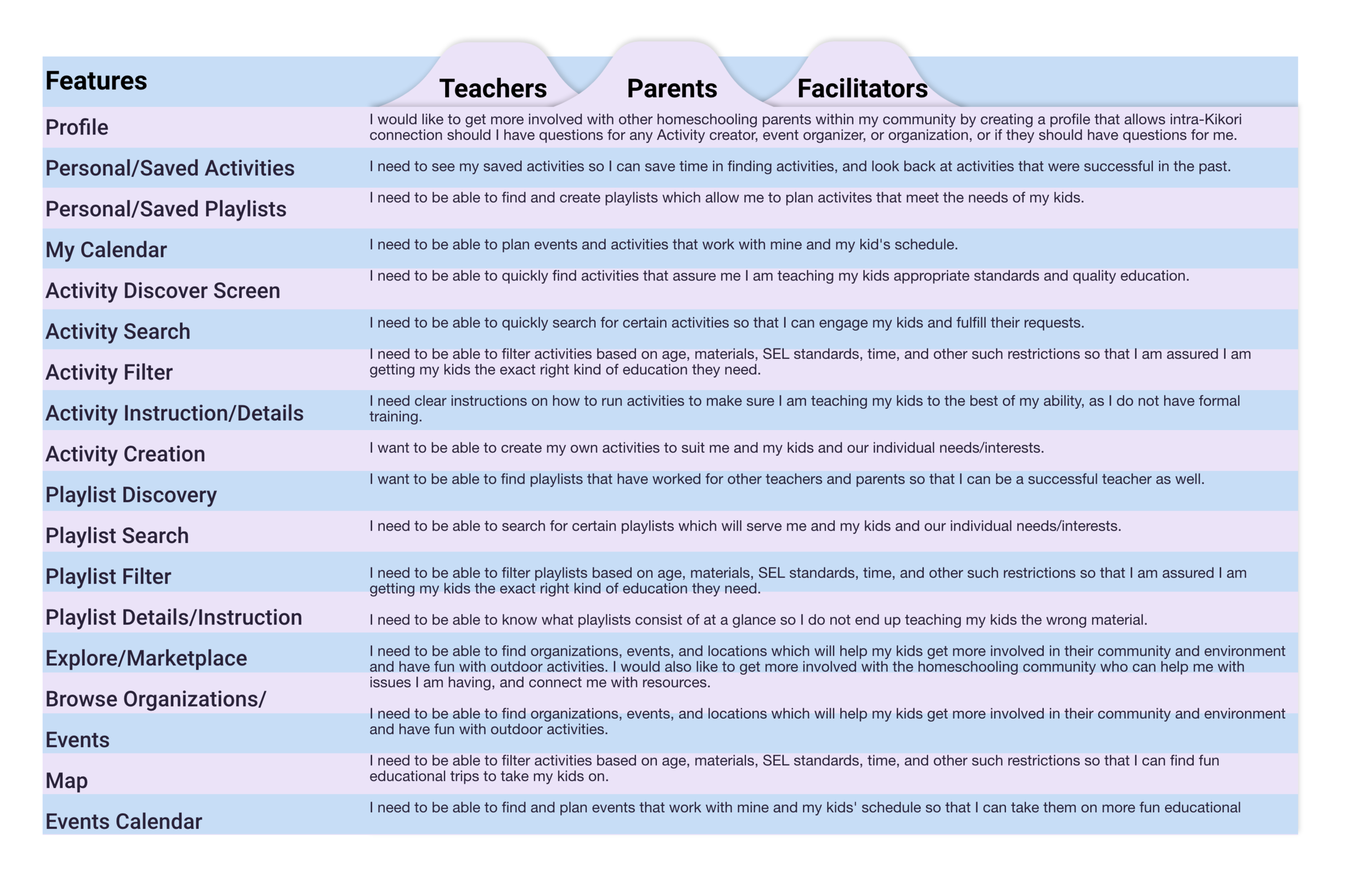
Features
After understanding our users better, we were able to decide on which features were the most important to integrate into the redesign.
Current App Features:
Users can search, like, filter, and create activities
Users can create Playlists (Playlist = list of activities similar to the colloquial list of songs)
Users can set created activities and playlists to either public or private
Users can create a very basic profile including photo, bio, and public activities / playlists


New App Feature Additions:

1. Gameification using a point system to display on your profile. Some factors include: #likes on your activities, #plays on your playlists, and #playtime (minutes you have spent using Kikori for activities with students
Reason: This will encourage regular usage of Kikori and create friendly competition, fostering a Kikori community and ensuring user retention.

2. Expanded Profile/Social Aspect: Messaging, Following/Followers, Timeline showing posted activities and playlists with commentary.
Reason: Teachers, parents, and facilitators have all expressed having a community positively impacts their teaching abilities

3. Calendar for scheduling activities with classes
Reason: All 3 user types expressed time constraints and scheduling to be an overarching issue in planning out experiential activities for students.

4. Ability to view liked activities and recently played activities
Reason: Users may want to repeat activities that went well and should be able to see their history without having to create Playlists.

5. Ability to search by map for organizations or events
Reason: All 3 user types expressed they want to do more outdoor and out-of-school activities with students, but often have trouble finding places/organizations that are easily commutable.
User Stories
To better understand the importance of these features and how we might best design them, I constructed user stories for each feature based on the insights I gained from interviews.


Wireframes
Current Home Screen

My Home Screen Redesign

Home Screen Redesign:
Acts as a screen for all of the user’s “personal stuff.” A quick link exists here for anything the user creates or updates themselves.
Has quick links to invite the user to jump into Kikori, encouraging interaction and user retention. For example an invitation to begin an activity the user has scheduled in the calendar soon, and an invitation to create their own activity.
Incorporates more straight lines and less angular shapes so the user is not distracted with cognitive load and can complete tasks quicker.
More color contrast for increased accessibility.
Current Activities Screen

My Activities Screen Redesign

Activities Screen Redesign:
Incorporates all ways to find activities (Search, Map, and Filter) at top of screen in equal size and importance. Usability testing showed that users had trouble finding how to Filter activities, so I made sure to make these buttons prominent, labeled, and with correct branding colors.
Uses floating icon for “Create New Activity,” in keeping with popular design trends.
Includes more important information in Activity cards so users can quickly find the activities they are looking for without clicking into each one.
Uses more intuitive content: instead of “Engaging Openers,” which is up for interpretation, I have replaced this with “Recently Added” and “Popular” carousels, encouraging users to jump in and interact with the app.
Incorporates more straight lines and less angular shapes so the user is not distracted with cognitive load and can complete tasks quicker.
Current Profile Screen

My Profile Screen Redesign

Profile Screen Redesign:
Keeps consistent design, does not switch back and forth from light to dark screen.
Incorporates more of a social feed timeline design, where users can comment about the Activities and Playlists they create and share them with followers as opposed to just hitting a “private/public” toggle. This makes creating more fun and socialized for users and encourages community
Incorporates gameification with points/stats that can be shown off to other users. These include #likes, #plays, #playtime, and followers/following.
Allows users to send each other messages, encouraging community buildup and interaction. This may especially come into handy if a user has a question regarding how to implement an activity another user created, or if users want to ask each other for opinions / direction about experiential education, which is a very new field for many educators.
The Testing Phase
Usability Testing
I ran 3 usability tests in which participants were asked to complete five tasks and answer some questions, as well as give Kikori features some ratings. You may see the full testing guide here.
Tasks were as follows:
Find an activity in the Ice Melter category and “Like” it.
Find an activity you would be interested in doing with one of your specific classes or students and “like” it.
Create a Playlist.
Find an activity created by Kendra Bostick and add it to your Playlist.
Go to your Profile and write a Bio for yourself.
These tests led to many valuable insights, but the two I would like to focus on are:
Physical Distancing versus Virtual categories should be more obvious and intuitive. Should be a category on the homepage.
It is not obvious if you are on the home page versus any other page. Navigation needs to be fixed.
Navigation Fix
Usability testing showed multiple users being unsure of where they were in the app.
Color is only used for the screen label in use, whereas before the Home button remained blue.
I added an interaction on the navigation bar in which the arrow slides to the button the user presses, a secondary indication of where the user is in the app.
View the full interaction here.
Category Fix
Usability testing shows users were very interested in physical distancing and virtual activities but had a very hard time finding them. Because this type of learning is the biggest challenge teachers face worldwide today, this is a very important issue for Kikori to address and help with.
Added Physical Distancing and Virtual activity carousels. This will be in conjunction with a “Popular” carousel on top, and in the future Kikori will learn to make more personalized recommendations for each user.
Added static Physical Distancing and Virtual categories at the bottom of each page in conjunction with “Ice Melter” and other popular categories, making these easy to find both on the Activities Screen and within Filters.

Next Steps
Features will be slowly rolled on into current application
This Kikori 3.0 redesign will be released in a few months, after many new features are integrated into the current app.
Usability tests will be conducted after every release
Surveys will be sent out to users after they have used Kikori in a classroom setting to ask about usefulness
Feedback will be gained from users within the app and through surveys and emails
We will continue to iterate and redesign as users give more feedback.