
fabe
for all, a beautiful Earth
A mobile responsive web application aimed at combatting climate change through the incentivization of positive actions.

The Product
For All, A Beautiful Earth (Fabe) provides a library of sustainable everyday actions, and users choose actions to take and log them on the app. Users will have their own profile, called a “Journey page,” where they can view their progress and share it with the world. In the future, a social media space will be created around this. This application is the brainchild of Steven Feuerstein and Vincent Morneau.
Completion Date: April 2019 - Current. Fabe is a work in progress and there are still many more iterations and testing to go.
My Role
My role has thus far been designing screens and flows for action cards, the action details page, the journey page, the homepage, and the onboarding/personalization process. In order to do this, I have had to advocate for the user by creating user archetypes, task flows, and conducting comparative/competitive analyses.
I am working with them and a team of 20 developers from around the world in an agile environment using sprints to bring Fabe to life.
Overview
Problem Statement
Fabe aims to motivate people to take more sustainable actions during their daily lives. How might I create an interface that engages users and motivates them to interact with Fabe every day?
Hypothesis
I believe a home page featuring personalized action plans, a profile page featuring progress tracking, daily challenges, and a social network will motivate people to interact with Fabe every day and continue taking sustainable actions.
The Discovery Phase
User Archetypes
After familiarizing myself with the goals of Fabe, and interviewing people of different age groups about their feelings on climate change, the actions they take daily, and their lifestyle, I was able to construct three different user archetypes.
I chose to make user archetypes instead of personas because it was important to me to align the goals of Fabe and its users, and because I did not feel I gathered enough research to construct detailed personas for all age groups.

1. The Active Action Taker
Target user starting at Fabe’s early development stages.
Early Fabe will only be a means to accessing and logging different actions for personal use.
The user who is attracted to this is likely already taking action, and wants to track themselves and learn more.

2. The Climate Change Sympathizer
Target user starting at Fabe’s next level of development.
Next level is when social media features are introduced.
This user will require motivation to use Fabe, which will come from sharing accomplishments on social media.

3. The Disconnected User
Target user that Fabe hopes to reach and “convert” during final stages of development.
Final Stage is when the product gains friction and becomes a fun, popular addictive app.
In these late stages, Fabe will also offer even more motivation to take action (hopefully reaching this Disconnected User) by teaming up with green companies to offer monetary promotions.
Comparative / Competitive Analysis
I researched products existing in this problem space:
Products that help people gain information about how they can reduce climate change
Products that help people track their progress
Products that allow people to share their accomplishments in a social format

I ran an analysis of 10 different products, evaluating the use of 12 different features. You can see the full analysis here.
I found that while many products suggest green actions people can take, very few create a game-like or addictive feeling around it. I also found that almost all successful progress tracking apps are in the exercise space, and focus on data visualizations and social sharing.
I realized I must combine these successful elements in my design: making Fabe informative, addictive, and visual.
User Flows
After speaking with the Fabe team, getting a handle on their ideas and principles, and sharing my ideas as well, I designed user flows to illustrate clearly how a user will interact with the Fabe app.
The Design Phase
Features
We are working in an agile environment using sprints, therefore building on features for each release. I am designing for future versions with present constraints in mind.
Future designs: Includes a social network
Current design: Personal logging and tracking of sustainable actions (given by Fabe Action Library)
Fabe Company Design Principles: Make Fabe addictive, uplifting, fun, and powerful (give power back to the consumers to create positive change)
Journey Page (Personal Timeline/Profile) Features for Current Release:
Action plans: #
Actions taken: #
My story (User bio) and Date Joined (User info)
Stats (Action stats made by fabe)
Visualization (Visualization of stats)
Things I have done (Actions)
Top 10 things I like to do (Common Actions)
Banner Quote (Decoration)
Name/Handle/Picture (User info)
Mockups
Low Fidelity
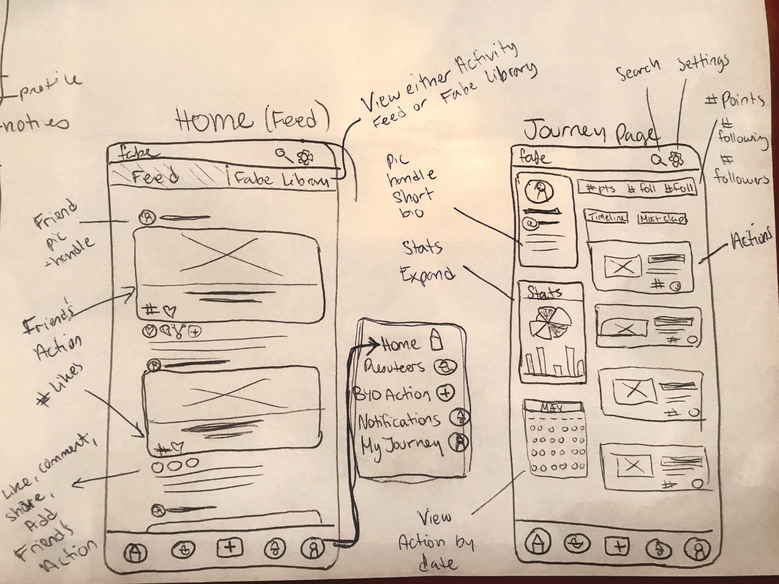

First Image: During this sketching session I had included too much design for social media (future iterations), and had to cut this down for my next round of ideas
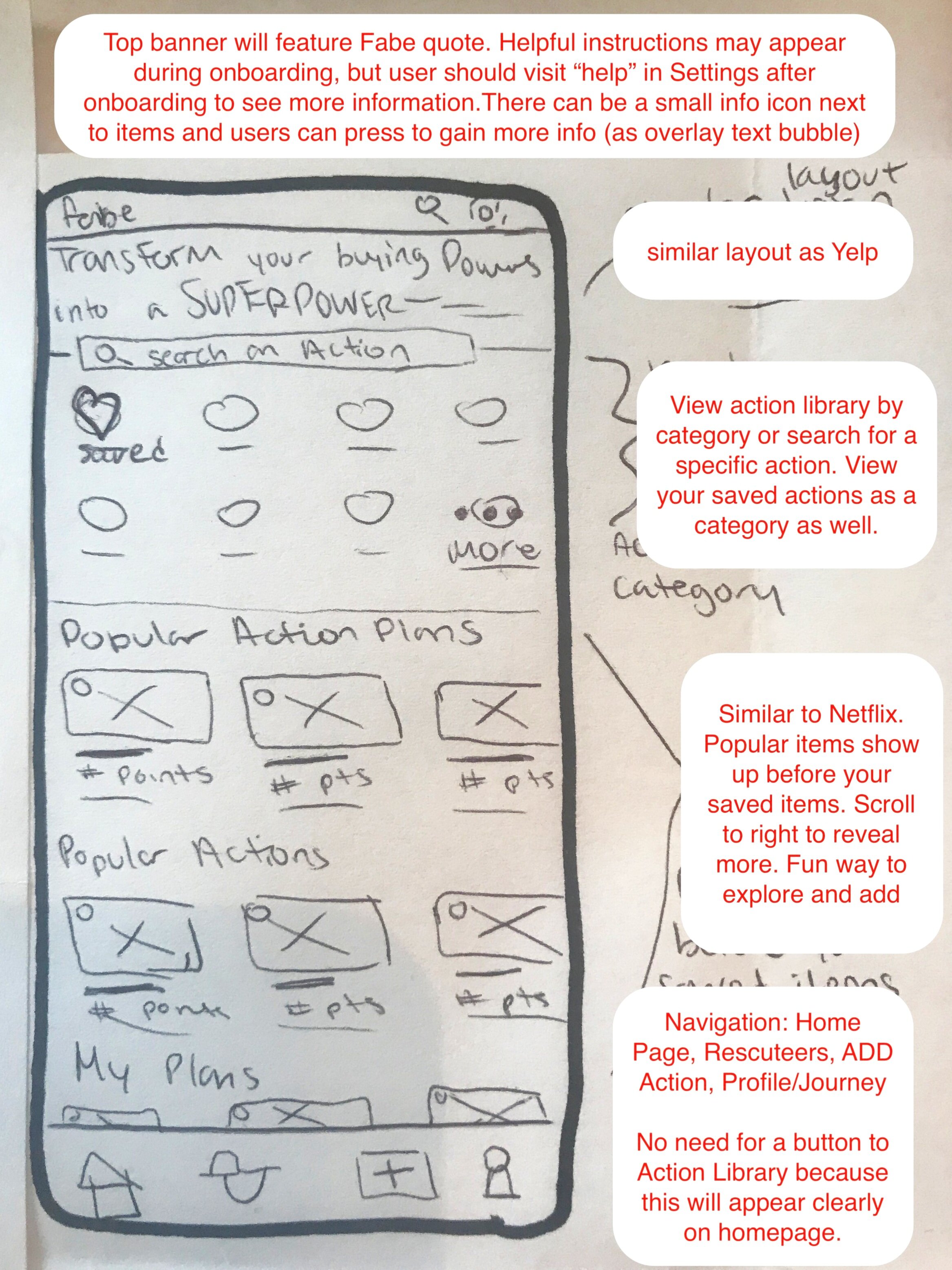
Second Image: In this iteration, I cut down the features to only include browsing of Actions in the Fabe Library. I utilized a horizontal scroll, getting inspiration from addictive and fun products like Netflix and Yelp
Third Image: In this sketch I had the Journey Page include two sections: a dashboard for stats visualization and an Activity Feed. The Activity Feed allows for an easy transition to a newsfeed when the app becomes social. For now, it only shows a personal chronological view of actions taken.
High Fidelity

Actions take form in clickable cards, that will open up to the Action Details page when pressed into. Or, the user can use some of the shortcuts for “sharing, adding to Action Plan, liking, or taking the action (fabe birdhand symbol as the button)”
Bottom navigation remains consistent, including buttons for Homepage, Rescuteers page, Adding and action, Notifications, and Profile (aka Journey Page)
Homepage features a Netflix-like horizontal scroll view of different actions which the user can take, like, or add into their Action Plan
Journey Page Dashboard allows users to see some visualizations of their progress
Action Feed allows a user to see in a chronological view all of the actions they have taken. In future iterations, this will be a social feed to be shared with other users
I chose to use the teal green from the fabe logo, as well as a brighter version of the green. I have also incorporated an orange color for active states and important information

Later on, I was asked to design a Notifications screen, as Fabe social features were coming to life.
The team expressed we needed notifications for things like:
Take an action
Log an action
Update Profile
New Action Added
Missions
Earned a badge
Social Media
Likes
Comments
Shares
I separated this out into four categories:
Social Media Notifications (profile image icon)
Actions Notifications (Fabe Birdhand logo icon)
Internal Notifications (cog icon)
Missions Notifications (Leaf icon)
Onboarding
After some light user testing where we watched users interact with the product and asked for feedback, we realized the app was not as self-explanatory as we thought. We knew two things:
We needed to give users more guidance on how to navigate fabe
We wanted to create a more personalized experience for users
I suggested asking the user some questions about themselves so that fabe may create a personalized action plan for the users to start off with. After using card sorting to organize actions into categories and figure out what types of questions we should ask, I designed a few visual layout options for the team:

The first option shows previews of the next question, which automatically changes as users pick their choice.
The second Option shows a time-lapse bar at the top so users know how many questions are left.
The third option shows responses as tappable images instead of plain text.

Final Design Choice:
Shows time-lapse bar at top so user knows how many questions they have left.
Shows multiple choice options clearly defined by “choose all that apply.”
Shows responses as clear text to reduce user’s time and energy spent on page.
Previews next question underneath.
Button to allow user to submit after they are finished making choices, and button to go back so answers may be changed.
These questions were initially to be asked during sign-up, but after researching best practices for onboarding and user retention, I suggested Fabe use a learn-by-doing approach. This approach would utilize hotspots, tooltips, and empty states. I used Adobe XD to come up with a mid-fidelity prototype to share with the team:
The team loved it! For those who don’t wish to view the whole prototype, here’s a quick synopsis:

After the user enters their basic information to sign up, they are quickly brought to this home screen.
A quicker signup decreases user burnout and increases user retention
The initial homepage features two empty states, which encourage user interaction
Hot spots lead a new user in the right direction
I have created an empty state for two sections: my action plans and my favorite actions. “My action plans” is illuminated with a glowing hotspot
After the user presses into “my action plans,” they are guided through a few questions, which awards them with their first personalized action plan
Once the user has their action plan, they are guided with more hotspots and tooltips to teach them how to use Fabe and its icons
Next Steps
Create high fidelity onboarding experience
Make pages more uniform
Conduct Usability Testing
Add in features and pages for social networking and for Action Plan gamification
Promote Fabe
Take actions towards a greener world